Design System
The Anatomy of a System Reborn
.jpg)
briefing
The company’s suite of web products relied on a proprietary design system that had grown inconsistent and outdated over time. As the products evolved, so did the need for a scalable, cohesive, and well-documented design foundation that could support both current and future development across teams.
Solution
I led the effort to modernize the design system, addressing legacy issues and setting a forward-looking standard for component consistency and usability. This included auditing and correcting flaws in existing components, introducing a robust set of design tokens, and implementing detailed documentation. The initiative culminated in internal workshops to onboard teams to the upgraded system and foster adoption.
the
approach
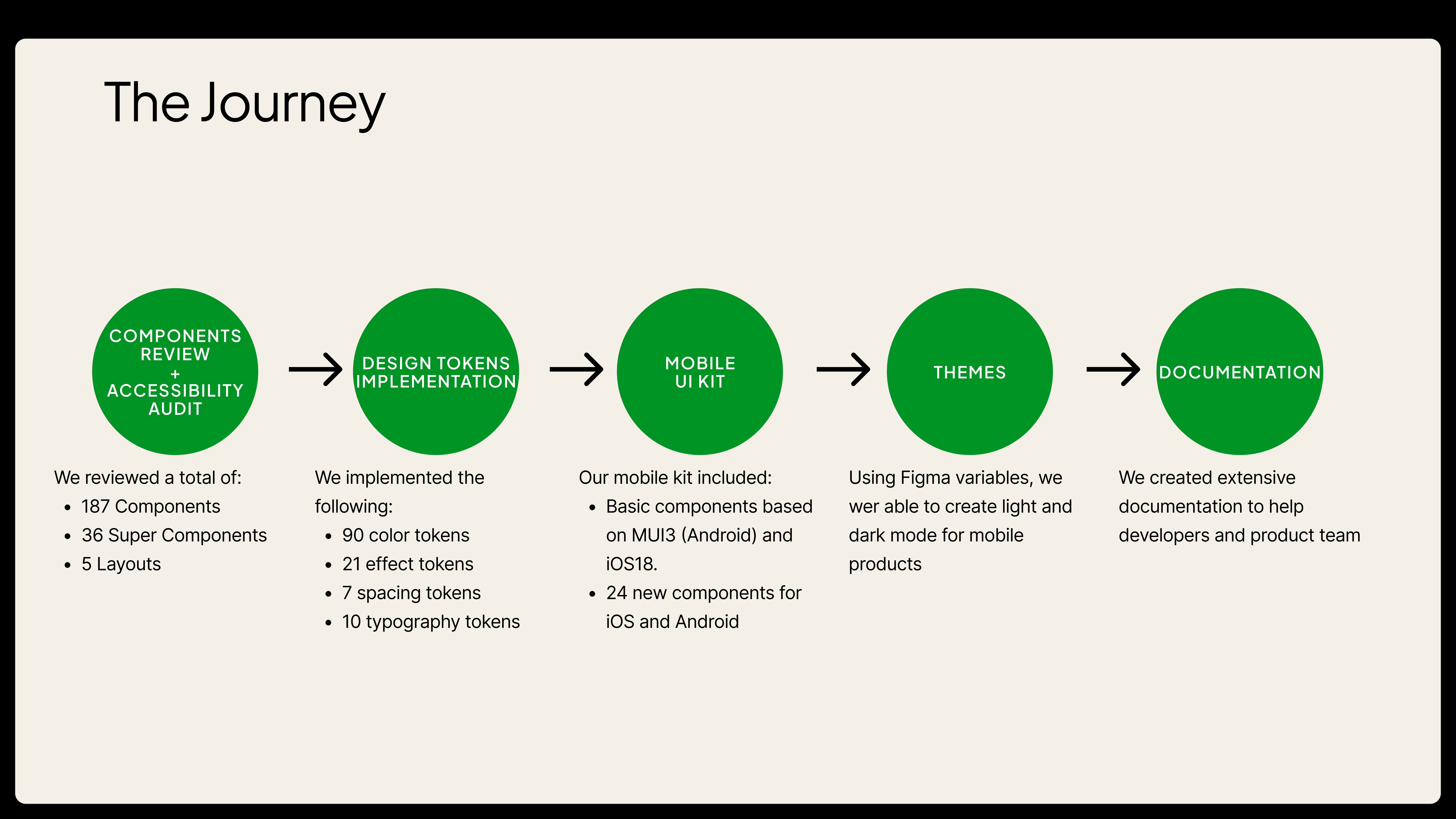
I began with a thorough evaluation of the current design system, identifying visual inconsistencies, interaction mismatches, and accessibility gaps. Collaboration with developers and designers helped prioritize which components required immediate attention. I refined and rebuilt problematic components, ensuring alignment with design principles and technical feasibility.
To support scalability and maintainability, I introduced a token-based system that standardized values such as spacing, color, and typography across all components. I collaborated closely with engineering to implement these tokens in the codebase, ensuring consistency between design and development environments. We also held internal workshops about Design Tokens and how to use Figma's Dev Mode to implement them.
Comprehensive documentation was created for each component, detailing usage guidelines, behavior under different states, and accessibility considerations. This was complemented by live specs and usage examples to reduce ambiguity. To ensure successful adoption, I facilitated a series of internal workshops and walkthroughs tailored to the needs of both product designers and developers.
Overall design process for this project
The
Outcome
The upgraded design system significantly improved design-developer collaboration, reduced redundant work, and enhanced the consistency and accessibility of the company’s digital products. The design tokens helped streamline theming and responsiveness, while the thorough documentation reduced onboarding time for new team members. The workshops fostered cross-functional alignment and empowered teams to confidently use and contribute to the system. The improved infrastructure now serves as a solid foundation for future innovation and scale. We also took the oportunity to create UI kits for Mobile products, both Android and iOS.
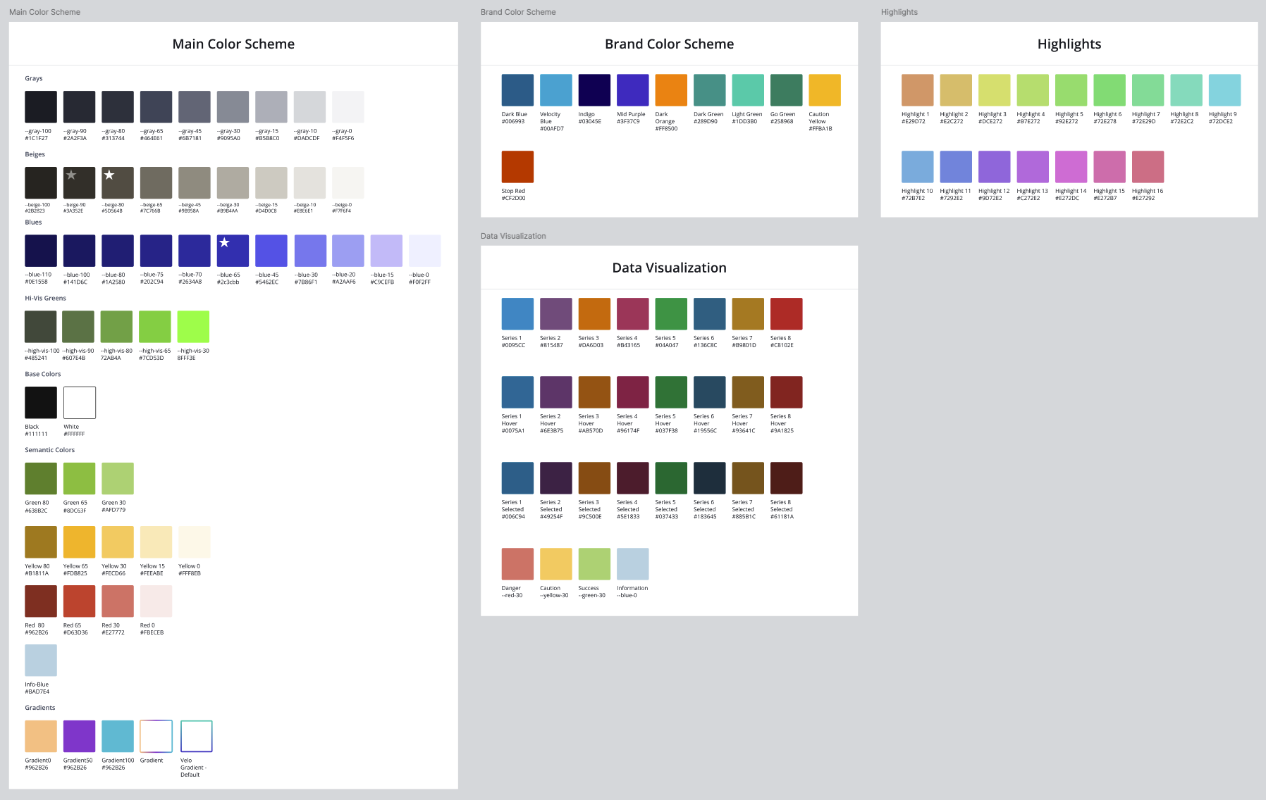
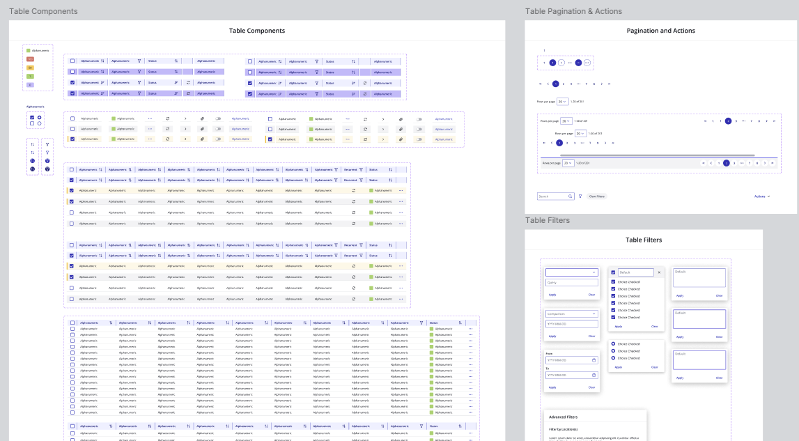
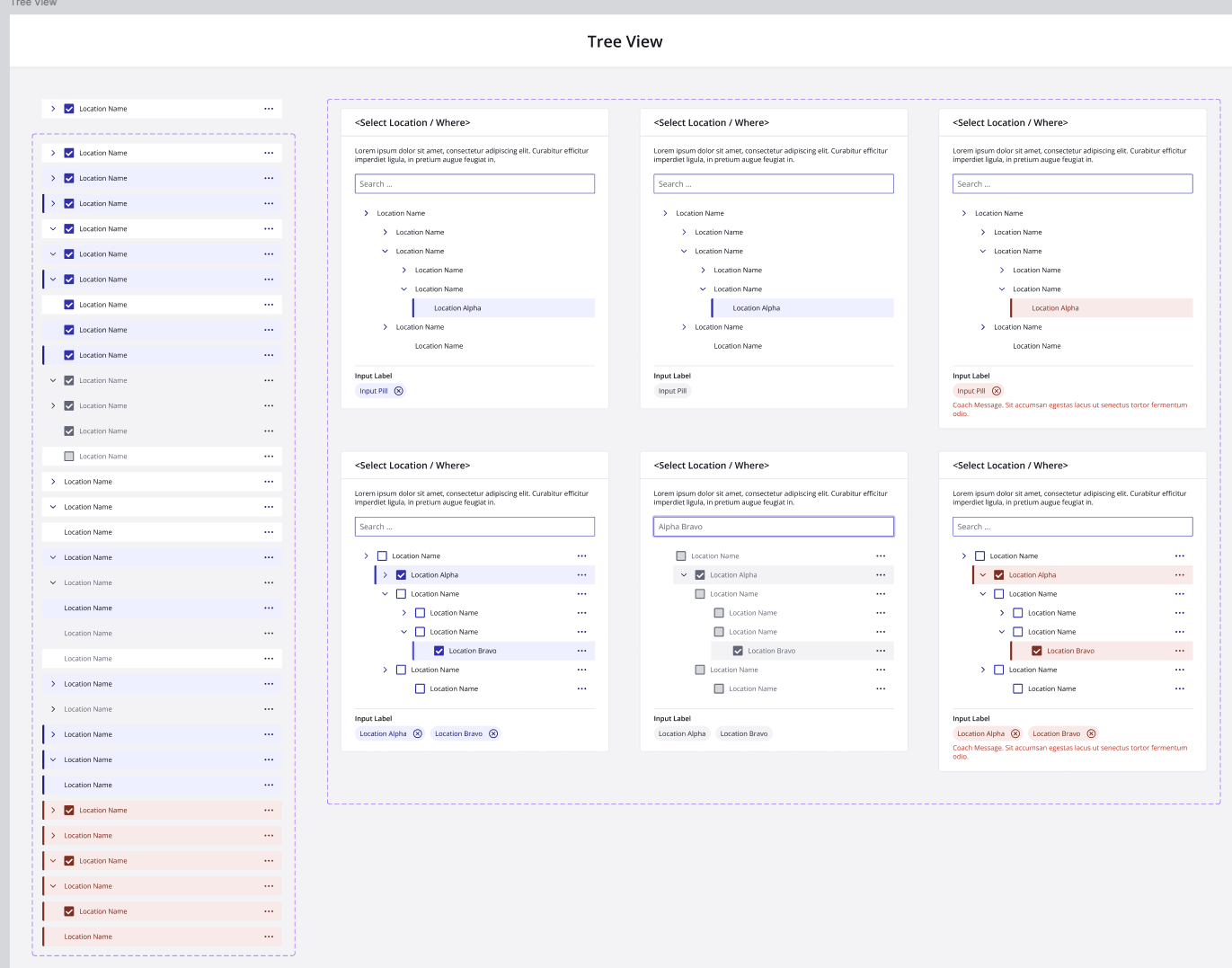
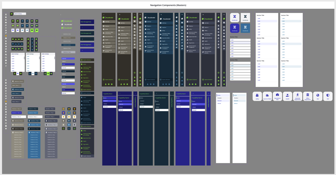
Some UI elements in the main design system
Lessons Learned
One of the key takeaways from this project was the importance of involving cross-functional teams early and often when working on foundational systems like a design system. While the initial focus was on design consistency, collaborating closely with developers revealed hidden technical constraints and opportunities for smarter implementation through design tokens. I also learned that documentation isn’t just about recording what exists—it’s a tool for alignment, education, and scaling design decisions. Lastly, delivering internal workshops highlighted the value of storytelling and hands-on guidance in driving adoption and building long-term engagement with the system.